Thursday 8 October 2009

Rationale

This summer's BLOG brief has highlighted a few things about, 1. My design philosophy, 2. My dislike to blogging- which is rather hypocritical as I rapturously enjoy other people's blogs and religiously follow many of them. This at first seemed rather depressing as it confirmed the truth all designers shudder in fear over: I am the spectator and not the participant. I observe, but I do not affect. Tragic.

Which leads me onto my design philosophy, being able to be spectator IS the key ingredient as opposed to participating blindly for a 'new-age' designer. I have also discovered that my passion as a creative person lie in the ability to solve real problems of real depth rather than going through the 'problems' designers are engineered to rectify with a few clicks of the mouse. There must be more things of -dare I say it- greater importance, to affect in this world than the kerning of a typeface.

Admittedly as a newly fledged designer I should be falling 'head over heels' with design and admittedly this is still true; I still succumb to the powers of a beautifully set out design/artwork. But as the more I blog and discover design for my self- I am starting to loathe my potential occupation.

Which is great... as by process of elimination I have my eyes set on a new road in design. 

Space, Layout  and Atmosphere. These words seem to be at the tip of my tongue every time I think of design. My ability to affect the space I am in is a key concept I am very interested in pursuing in the discipline of Interior design- which is fitting as I can spectate AND participate all from the comforts of rooms and public places I design. My emphasis on design has always been about how it makes others feel and the credibility of purpose of the design.No point creating more junk to pollute the world. Designers have a greater call to be more socially responsible in their work especially graphic designers, printing excessively and adding to the unnecessary waste of natural resources.

This has been the 'Eureka' moment in terms of working out what I want to achieve for my final project- a glorification of new media: namely the world wide web. This medium is a perfect way to still be a 'problem solving' designer with minimal costs as no paper is wasted and the audience has freedom again to choose what they want to see, when they want to see, if at all. Furthermore it encourages the diversity of inspiration as communication and knowledge from across the world is boundless.

My personal crusade for this blog was to identify new trends and link them to old trends as everything passes through a circle. Therefore for my final project I want to gain a deeper understanding of layout and structure using grids for print work and apply them to web design, and by that implement a new way of interacting with the screen.


 As a designer I see this as the real creative hub we are in; being active in the process of recycling and refining-rather than innovating.


Referencing aims and objectives:

The "film" I had the most joy posting up and discussing was not an actual film per say... it was an advert that had stunned me to silence when I saw it on the t.v.

Admittedly, I dislike adverts during TV programs and I am part of the 99.9%(please do not quote me on this) of the population who dive for the remote as soon as a show is scheduled for a break in the desperate attempt to find ANY alternative to watching adverts while we wait- a.k.a channel surf(ing).   

However on a normal day of watching America's Next top model, about to reach for the remote begin channel surfing to avoid incessant adverts, I stopped. 

A woman's voice calmly spoke about her experience of a routine doctor's visit- it was this first part that really captured my imagination as there was no jingle attached, no hugh typefaces darting across the screen and no 'comical' stuffed animals selling things. 

It was just a normal conversation as though she was talking to just me in the room. When the advert had finished and I realised that it was a cancer research advert and was truly impressed. 

From a design perspective I made me think how design can something be excessive and conceptual- but still fail to make an impact, if any...and something so simple could affect so many effortlessly. 

This has given me a greater understanding as to what type of designer I am and what my role as a designer is. To create less - but effect more. 


Photography ,the process of capturing and editing. Looking at a particular artist- Micaela  Rossato from my blog, I can see how this high level of skill does not come by easily. Although her work is arguable very simple and static, the effortless of it all, from the composition choice to the use/lack of colour, to me, all suggest that there is greater understanding of photography rather than just the clicking of a camera and hoping for the best.

This has re-affirmed my decision to focus my final project on space, layout and atmosphere. These words require a high level of understanding of how things are suppose to affect each other to create either harmony or anarchy.  


In conclusion, it seems I have achieved more than I thought I would via Blogging- the Eureka moment did come-Alas, I am saved...

My newly formed mission statement:

To create social- responsibility design.


So at last.

 I participate.

Therefore I am.


Friday 25 September 2009

The world and his wife are photographers these days...


As we are all aware, everything has its advantages and disadvantages.

The popularity burst of 'Facebook' in the virtual realm is a key reflection of the statement above.
Advantages: It has flung open the door of communication to the common man, as you can keep in touch and have daily updates with friends from around the world free (as long you have access to the internet).
Disadvantages: The age of stalker-ism is upon us. Facebook, encourages us to be nosy and critical of other people's lives/lifestyles all in the hope of promoting our own lives in the best possible light. 

From a designers view- it is a platform to showcase talents/skills and reach a wider audience. However, when I was facebooking I stumbled across a friend's album on her trip to the seaside. 
Expecting it to be humble snap shots of the beach and attractions, or at best, wannabe-photographer style shots- I was amazed by the high level of capturing and editing. And the most interesting part was that she has no background in photography and the pictures she took were not consciously taken!

Which leads me to ponder on the originality of many design/art based profession- its seem everyone and anyone can do graphic design, high quality photography, video editing without ever stepping foot in a class based on those disciplines.

This is a big advantage as well as a big disadvantage- Lack of exclusive means the credibility of the profession is descaled but in the same breath; lack of exclusivity inspires a different type of 'creative'. The one that does not have a clue about being creative... but manages to does so - ever so naturally.


Mind boggling.


Blending in


Cranes: Intrusive or not?

Walking through built up areas in any city, there is one guarantee in every one of these places. That there is a crane hovering in the sky. For me, these are the most functional and aesthetically pleasing pieces of construction devices I have ever seen. They tower over us like dinosaurs but we have grown so accustomed to them that we hardly notice them when looking up in the sky. 

Have we gotten so used to seeing them that they become invisible to us? Is city life empty without them?
They represent the growth of a city, a sign of constant development. Which in times like this when the economic climate is humid and stifling, seeing these giants are re-assuring. 

What will be interesting is if one day there were none to be seen in sight, will anyone notice their disappearance... they say absence makes the heart grow fonder, so perhaps we will. 


This gives me an idea to juxtapose these giants in poor countries/areas... to signify the lack of constant development as a statement.


Just turn it upside down


Zhang is part of the growing collective that is Chinese contemporary art. His work 'Dali offsprings' has been the most successful in terms of gaining media attention. 

Chinese Offspring is one of Zhang's best known works. Consisting of 15 cast resin figures suspended from the ceiling, each sculpture is a representation of a migrant construction worker, a vast underclass who contribute to the modernisation process at it most visible level. Since 2003, Zhang has made 100 of these effigies in tribute to their unsung heroism. Zhang's work not only champions the individual plights of these transient labourers, but also records the one of the most important phenomena of new Chinese order: the growing schism between poverty and wealth. Zhang's figures are hung by their feet to denote their vulnerability and economic entrapment. Each bears a unique tattoo issuing them with an edition number, the Chinese Offspring project title, and the artist's signature of authentication - a normal practice in indexing art construed as a witty commentary on social engineering and population control.

CITED FROM - Saatchi, http://www.saatchigallery.co.uk/artists/artpages/zhang_dali_offspring.htm

When I first saw Zhang's work I was really intrigued by the simplicity of his work but how much impact it had. From just hanging the sculptures upside down elevated the impact as we are used to seeing sculptures in the upright way. 

More than just a sticker


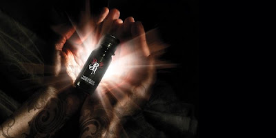
I was out one evening with a group of friends and one of them pulls out a bottled drink from his bag and my face lights up. 

The Desperados bottle is an ordinary bottle,nothing too spectacular here, and with the drink inside it, tequila- made in France, nothing too life changing... the real joy of this bottle rests on the outside of it.

The branded sticker.

It was so aesthetically pleasing I had to peel it off the bottle and take it away with me. The right colours, the right shapes, the right typography, the perfect amount of white space, the right kerning... it just sings well together as a whole. For me anyway. 


Express me

As a free lance graphic designer I get asked to design a range of things, my main revenue comes form t-shirt designs. 

Since the late 1980s and especially the 1990s, T-shirt designs have been a medium for self-expression and advertising, with any imaginable combination of words, art and even photographs on display.

As a designer I see it as a great medium for self promotion as people are become walking adverts for my work so when they want have something that expresses them, they are indirectly expressing me.

Its a Win,Win situation.  

Make it work


This is a banner I designed for Leeds Action Student Volunteers society. An organisation run entirely by students at Leeds University; set up to provide a free service to all areas of the community, from arts and crafts classes for kids to fun days out for disabled children.

I am currently working on the society's Publicity team and for the website I was asked to design a welcoming and creative banner, with the objective of capturing the attention of the audience (students) and encouraging them to join the society. 

From a previous module I did  earlier this year I had learned the value of simplicity. For a website it is the commonplace notion that people hate pop-ups and the excessive flashing of possible "prizes" to be won from some online competition. Therefore I decided to keep my banner as simple and as to-the-point as possible.

Yes. I am a FREELANCER...but that doesn't mean I work for FREE!


During this summer I have been working with several business-start ups in their campaign to launch their businesses in their respective markets. I have decided to add this to my blog because I had to create a brief for myself. All I was given to work with was the values of the company and from that I had to create the visuals to promote their services. This is most useful to how I will approach the final project brief that I will be setting for myself also. A lot of primary research was done to bring out the purpose of the visuals I had to create.  


Trash = Treasure


Using recyclable materials to create art-forms is a new way to approach being environmentally friendly for designers and artists alike. It also stands as a challenge to push the level of creativity with the materials recycled. 
This light bulb is decorated with recycled bottles. 

http://www.inhabitat.com/interiors/

Simple


Tactile design. 

Bold and Beautiful


Typography in its element. The choice of paper to print on really dramatises the overall aesthetics of the package. Proof that all aspects of the design of a product needs to 'add value'

all shapes and sizes


The re design of the 'Relentless' drink into a smaller and more ergonomically friendly size is a good step towards drawing in more of the energy drinks market. The small sized can re-enforces the promotional push for it still having great impact just like the regular sized cans. 

By just changing the shape of the product it has gained more appeal for women as the can is easy to carry around and loses all connotations of it being a male driven product as the original can was the same size as a beer can. 

Home, Sweet Sweet, Home


The Ikea website strikes me as a 'mini- ikea;' in the sense that the ambience of the stores is used also for the website. The global brand's tone of voice of 'affordability with style' is distilled into the structure and user- experience of the website. The clustered nuggets of home decor inspirations are still a feature on the website, through visuals. Still creating the idea of lots to choose from.
They even have an online shop assistant 'Ask Anna' is an icon of a female who looks approachable and more importantly user friendly with both audio and typing. 

This is a good example of how everything compliments each other well. User experience is the key to Ikea's marketing strategy. If people like how they feel in a certain place, not only will it encourage repeat visits it will also encourage viral advertising. (word of mouth) 
Ikea are known for their 'show room' styled stores, where customers have to  go through different parts of a home set-up, kitchens, bedrooms etc before they can choose what they want to by, but the majority of the time,  customers will leave with more than they had planned to buy. 

Therefore it encourages me to look deeper in user experience for my final project.


Blinding new technology


Putting light into static materials seems to be the latest craze for designers around the world. 

drool...


If we all had the chance to design a hotel, what would we incorporate in that space?
This book takes us on a journey into the creative minds of architects and designer across the world. 

...What would you like to see glow in the dark?


Design of furniture has been an area of interest to me as it governs so much of our life as we are surrounded by furniture all the time, in our homes, offices etc. 

I don't know how safe it will be to sit on these chairs but from a design perspective it is very dynamic installation piece because it is an everyday item subverted into a grand ornament. A true celebration of the ordinary. 

Is the grass is greener on the other side?


Combating the green house effect and global warming has been the cause of scrupulous activity for many designers and world leaders through this decade.
The need to think of creativity ways to design for a sustainable future has now been answered with the emergence of botanical habitats; Vertical Gardens. 
Patrick Blanc is a botanist and the inventor of this 'living wall'. His concept is a modern alternative to materials used now in archecture.
The plants grow without the need of soil which allows for more oxygen to be produced in the environment to reduce the the effects of pollution. 

Nut cracker


The new shape for a woman.
Proof that fashion and design in general is always recycled. This shape although short and more abstract can be seen as direct inspiration from the Victorian era of bustle skirts and corseted tops. 

Inspiration is Everything. 

Exchange


This website is a hybrid of inspiration and social networking. Fashionistas and wannabe models flock on to this website to share their fashion. 
The recycling of ideas is what really captured my attention as each member on the site is committed to looking original and being fashion savvy but from scrolling through the catalogue of images I find that more of them look like replicas of each other than anything. 
Fashion allows individuals to create a visual voice for themselves but ironically, everyone seems to share one voice- though at different pitches. 

Looking at the structure of the website however, the page rarely needs to be refreshed as it relies on the user to continue to scroll down to view more images. This simply action allows for a greater user experience as you can continually see the images without having to waiting for pages to upload. 


Geeky, Sexy, Cool


The year of the Geek

For decades, the unsung hero that is the Geek has long played the victim of many trials and tribulations in cinematic history. The Geek, is normally either the evil character or the love-struck gimp.

But now, Fashion has chosen this character as its mascot making Geek glasses the most fashionable accessory to own. The whole attitude of being a geek has been glorified through fashion making fashionistas around the world rush out to get a pair and become Geeky, sexy, cool.


N.B.

Taking something that has a different tone of voice and adding to it or using in a different way.


IS IT NECESSARY?

Water features have been a key element in architectural design for public spaces.  

fountain (from the Latin "fons" or "fontis", a source or spring) is a piece of architecture which pours water into a basin or jets it into the air either to supply drinking water or for decorative or dramatic effect.

Fountains were originally purely functional, connected to springs or aqueducts and used to provide drinking water and water for bathing, but in ancient Rome they began to be used as decorative elements in gardens and courtyards. The art of fountains reached its peak in the fountains of the palaces of Moorish Spain in the 14th century; in the Italian Renaissance garden in the 15th and 16th century; in the fountains of the Gardens of Versailles in the seventeenth century; and the decorative fountains of Rome in the seventeenth and eighteenth century.


CITED FROM wikipedia :http://en.wikipedia.org/wiki/Fountain


This had made me question the need for water fountains anymore. It has become solely aesthetically pleasing; which counteracts the issues we are seeing in deprived areas of the world. If these water fountains were introduced in countries where access to clean water is non- existent the appreciation of the water features will be far greater than how we, that live in the developed world, appreciate them. Personally I see them as a symbol of decadence and opulence. We have so much but we don't use things productively. 


As a designer I strongly feel our need to be more socially responsible for what we produce and how we produce it and who it effects.  

The Big Kids Chess club


The design of the interior space is as important as the design of the exterior. I have noted that I have been looking at design, through this blog, in a more circumferential way, meaning I look at the WHOLE package as opposed to just the typeface choice for instance. This has become very important to my design process as I believe every decision made has to compliment the whole project. 

Walking around in Leeds City Centre and the surrounding area you will find a patch of ground fully dedicated to the word 'community.' A big chess board is set on the ground in a quiet part of the city centre situated outside the galleries. The chess mat is equivalent to the playground in parks for kids- giving 'big kids' the opportunity to socialise and have fun.

Designing for the public space in this way is very interesting as the purpose of a chess mat is to encourage interaction and positive activity which is something society doesn't normally encourage in their everyday routines. 

As clear as day


In March 2008, the completion of Heathrow Terminal 5, a £4.3bn venture, did not receive the accolades it deserved due to the inefficiency of the services available when the terminal was open. There were reported cancellations and delays on all major flights which took away all the focus of the grandiosity of the newly built airport. Even more poignantly, environmentalists were not in support of the new terminal, as they believed it would only increase the pollution the world has been focusing on to limit. This can be seen as a highly hypocritical move by the government to spend millions of pounds creating more pollution with the arrival of the new airport; but in the same breathe spend millions on advertising campaigns telling us all to curb our wasteful lifestyles for the sake of the earth.

The true focus should be on the spectacular use of glass for whole building. 


What's your design philosophy?


As a designer myself, this show is a great way to see how creativity is profitable. Although it is mainly product design that Phillppe Starck is promoting, it still stands as a beacon of positivity for aspiring artists and designers alike.

We as an audience from the very first episode are introduced to Phillppe Starck, the vehicle of success of this show, as a very creative and abstract thinker and do-er. 

For me, the main message from Phillppe Starck's sometimes incessant ramblings is to develop a design philosophy. Every designer should seek out the message the want to convey to the world and by that, go about producing things that not only speak of you as a designer but speak as well for you as a designer.  

This show is shown on BBC2, Mondays 11.00 pm
http://bbc.co.uk/i/mw165/

Thursday 24 September 2009

How to go beyond ourselves


"Design without soul is pointless."

'The Alchemist' is a powerful story, which takes the reader on a sublime journey of the true meaning of life, our dreams and ambitions; proving that they are all meant to be lived out... 

The main character is a young man by the name of Santiago, a young Spanish shepherd, who travels around the world pursuing his personal legend. The main focus of this novel is encompassed in this line in the novel : 
...there is one great truth, whoever you are, or whatever it is that you do, when you really want something, it is because that desire originated in the soul of the universe. 
 
This suggests that all things are attainable if they are really desired...although this is a highly romanticised outlook on life, it highlights the notion of things being destined to happen, regardless of desire. 

This book acts as an escape/ comforter to many of us who are not content with the way our lives are, whether it be through our careers, our relationships or our own personal self- and causes us to re-focus our energies on the dreams that we have stopped chasing and re-invest in them.  
I believe It is a very potent 'self help' book and I am very surprised it is not listed in that category when you go into a bookshop, the tone of voice and the style of writing suit the theme very well; the omniscient voice through the book spurring us to go beyond ourselves. 


Worth the small print


Half of a Yellow Sun is a very thought provoking and at times chilling account of the Biafran War in Nigeria, told from the perspective of a house boy named Ugwu. The power of words was what struck me from reading this book, to the point where it left me angry, tearful amongst other emotions; eagerly turning page after page to resolve the story. 
This led me to think about Propaganda posters during war and political campaigns. The ability to use words and images for a greater purpose.This is ultimately what we as designers are called to do. 
We are expected to generate emotion from the words we choose and the images we edit.

Such pressure.

Such Art... when done well.


This book is written in very small print which can be off putting at first, but surprisingly the content and impact of the story being told drives the reader to "keep at it."

I strongly recommend this book for those into who are into documentaries and historical issues. 


Black and White


The Leeds Rag Mag exclusive to student of the University of Leeds has a very talented designer doing many wonderful creative things with two colours: black and white. His name is Jon Simmons. 

He actually makes me want to read the magazine. Because the images are so inviting and thought provoking. And the best part I  can see the raw nature of how he is working, by the rough edges of his silhouettes, amateur photography and focus on different exposures of light on the paper to create a different tone of voice each time. 


ENJOY!
www.jon-simmons.co.uk

Really?


Situated close to the centre of town the Leeds Blenheim Baptist Church has left many passer by seeking an epiphany as to why the materials chosen to build this church were chosen. The iron slates are already distressed and it has only been up and accessible to the public in the last month. 
The iron plates are basically reacting to the environment at such an accelerated speed and rusting- rearing its ugly head slowly with the passage of time. 
If this is not a conceptual work of art then I do not know what is. 
Thinking about it on from a religious stand point- the building on the outside is a reflection our sins and the sins of the world- but once inside the building your sins no longer take precedence. You are beautiful again in the presence of the Lord. But only in the presence of the Lord. 
Like sin- its is not something we want to openly associate ourselves with, so those who turn their noses up at the building are the very people that judge excessively without trial. The church passively invites passers-by to want to see past the exterior because it is totally different from the interior. But only by choice. There is no allure. You have to want to see for yourself. Much like Christianity. 


HOWEVER.
Based on design.
Beautiful angles. 
Creative material used for construction.
Forward thinking design.


Its a shame it looks so ugly.


Simply does it


Simple, Informative, User friendly

Im sold on the idea. I think this is what a website should be like in terms of usability. Easy to understand and quick to navigate around. 

http://www.threadme.co.uk/who-we-are

Time waits for no-one?


This epic film depicts a complex story of love and it quest to break through boundaries of differences in age, time and knowledge. 'The publication in 2003, Audrey Niffenegger's fantasy romance The Time Traveler's Wife became a US bestselling smash and global book club swoon' - CITED FROM The Guardian : http://www.guardian.co.uk/film/2009/aug/13/the-time-travelers-wife-review

Although I only saw 3/4 of this film, I have to say it has excellent choice of cast, but like most time machine based stories, it loses many viewers in actually believing in the fantasy because things just does not seem to match up and make sense. But luckily the plot carries the film so these mistakes are not so distracting.  
The aim of this adaption of he novel is to challenge the so called obstacles we may face when it comes to who we fall in love with. 
But we are reassured that love conquers all. Time and Time again. Literally.

This scene for me held too many paedo- like connotations for me to watch it comfortably and I strongly believe the story would have survived without this insert. It slightly took away the innocence of the little girl as she appeared to know of things far beyond her years- which didnt suit the actress playing it in my eyes. This however reminds me of the way people responded to the award winning film 'Broke back Mountain' which showed the intimacy and sensitive nature of homosexual relationships in an unexpected timeframe.This subsequently was the reason why so many people flocked to see it. Never mind the plot. So maybe, for the director of the film, it will work to his advantage after all.


Overall impact:

Does the time travel work as a metaphor for our memories of the past and expectations of the future? 

Whatever your answer, I think we can all agree that it is definitely a romantic musing on whether we are always destined to meet The One. (http://www.guardian.co.uk/film/2009/aug/13/the-time-travelers-wife-review)

And the answer to that is Yes.